
Some people recoil when they hear the phrase “Modernism,” equating it with stark white walls, rigid linearity, and all the charm of a prison cell. While these associations aren’t always unfounded, Modernism also has the ability to be warm, inviting, and organic. Don’t believe us? Let us present Exhibit A: the Mid-Century California home of Lisa Wong Jackson.
Designed by prominent Postwar architect Cliff May, the house features some of the hallmarks of Mid-Century Modernism: large picture windows, an open floor plan, exposed structural elements, and light, light, light! Lisa, a graphic designer and proprietor of stationery company Good On Paper, lives here with her husband Nick and two sons, Lucas and Theo. “Over the years we put a lot of work into it here and there,” she says, “creating an indoor-outdoor living space that’s both functional, fun, and safe for our young and very active boys. We wanted our home to be open, light and airy—a little Mid-Century Modern and a little Scandanavian—but it also have a kid-friendly and ‘real’ feeling to it.” The result is a vibrant, effortlessly inviting home, one that is both unpretentious and sophisticated, elegant and laid-back. Check out all of the photos of Lisa’s lived-in Mid-Century home below!
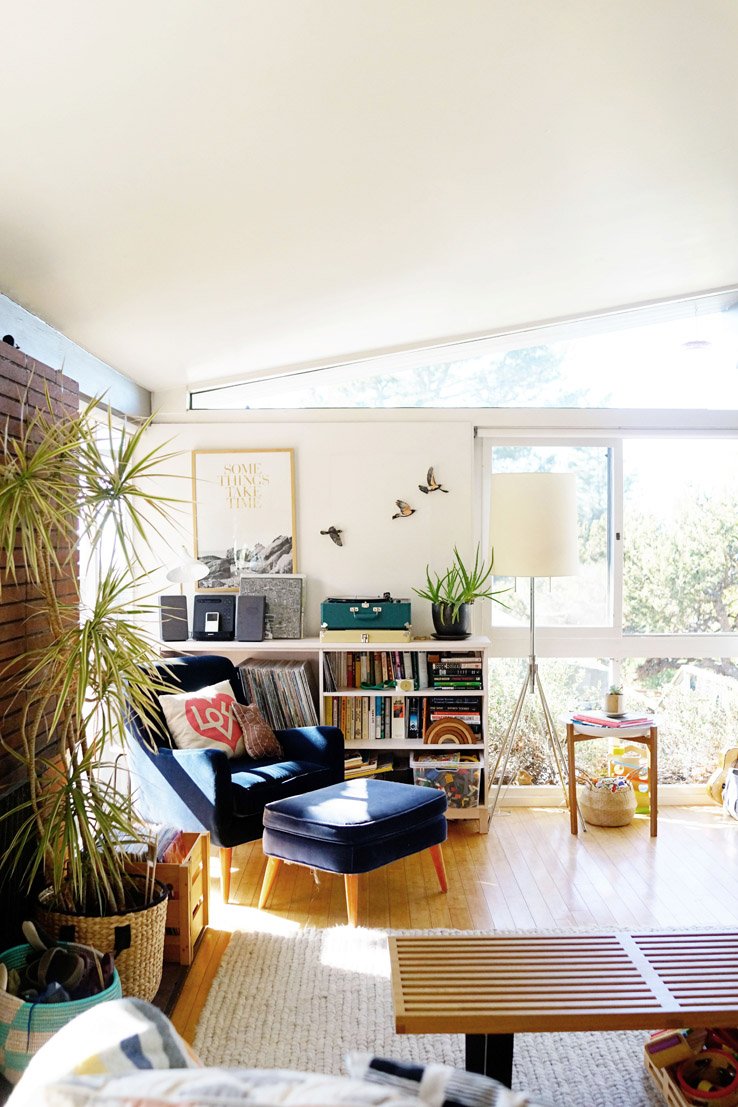
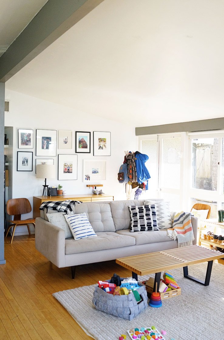
“Our front living room area is my favorite part of the house,” Lisa says. “It gets flooded with natural light and warmth. The open floor plan allows for a seamless flow into the dining room and also makes it easy to watch the kids while cooking in the kitchen. This is where everyone loves to hang out.”


“Our home doesn’t have a lot of storage, so our all-white credenza is a great solution. We love to display our favorite prints, plants, ceramics and my new 2016 Calendar.”

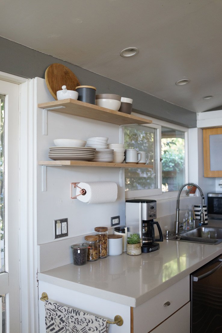
“The open kitchen has plenty of drawer space, but not much cabinet or pantry space, so I try to keep it as minimal as possible. I love the DIY open shelving we built for our plates and bowls—it’s made from two pieces of unfinished red oak and spray painted white brackets.”
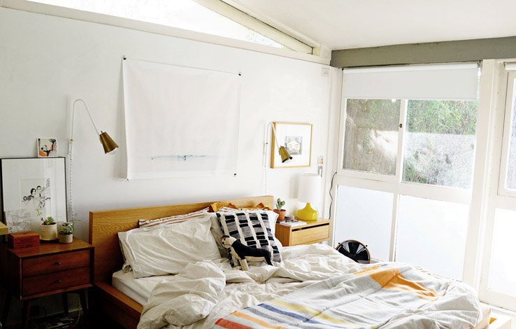
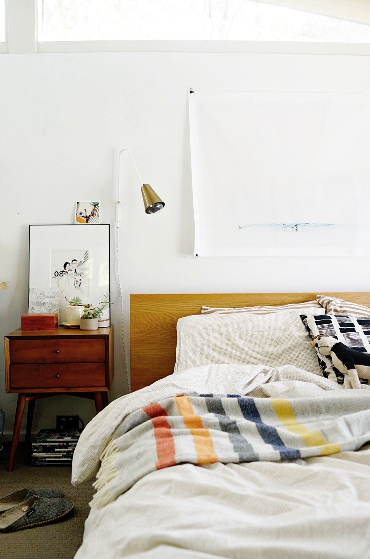
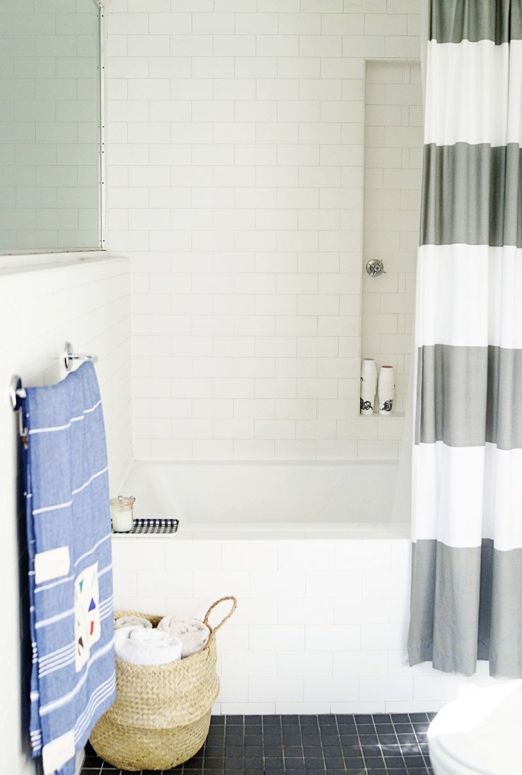
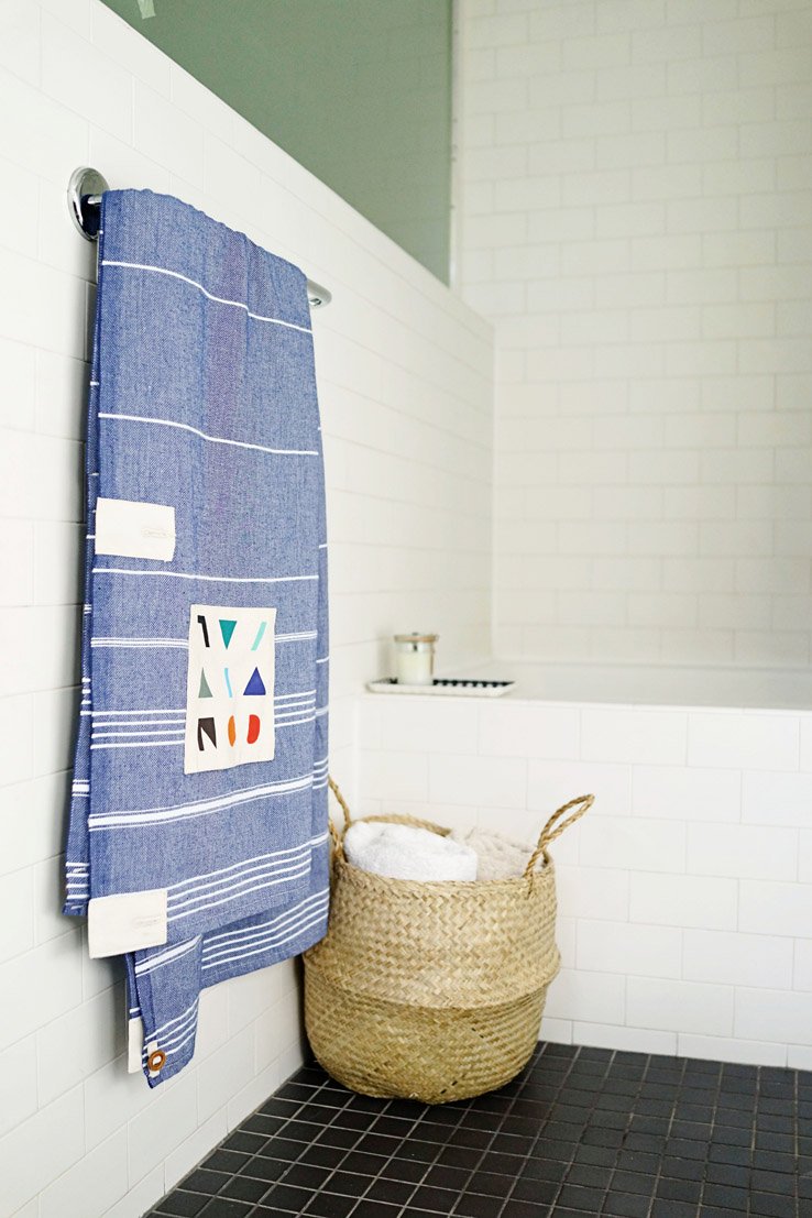
“This is our master bathroom. With floor to ceiling white subway tiles and black tile flooring, we wanted our bathroom to be a neutral space with a few pops of color, pattern, and texture from the shower curtain, towels, and basket for storing extra towels.”

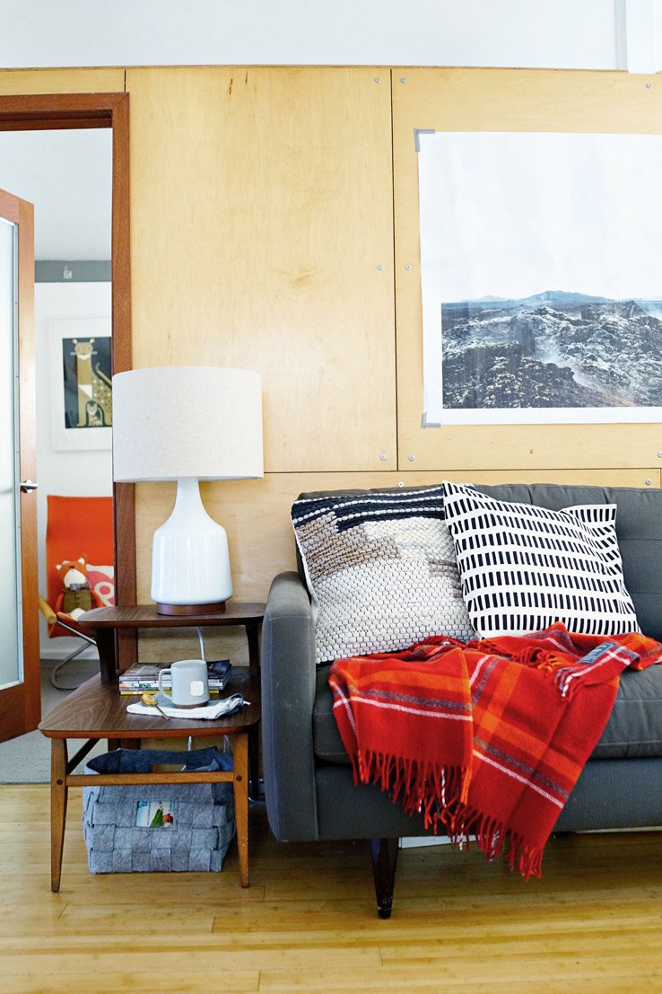
“The back living room is our entertainment room where we curl up and watch movies and listen to records. Above the couch is an engineers print from my talented friend and photographer Jennifer Young. It’s a large version of one of the pages from our latest 2016 calendar collaboration.”


Original article and pictures take blog.westelm.com site
Комментариев нет:
Отправить комментарий