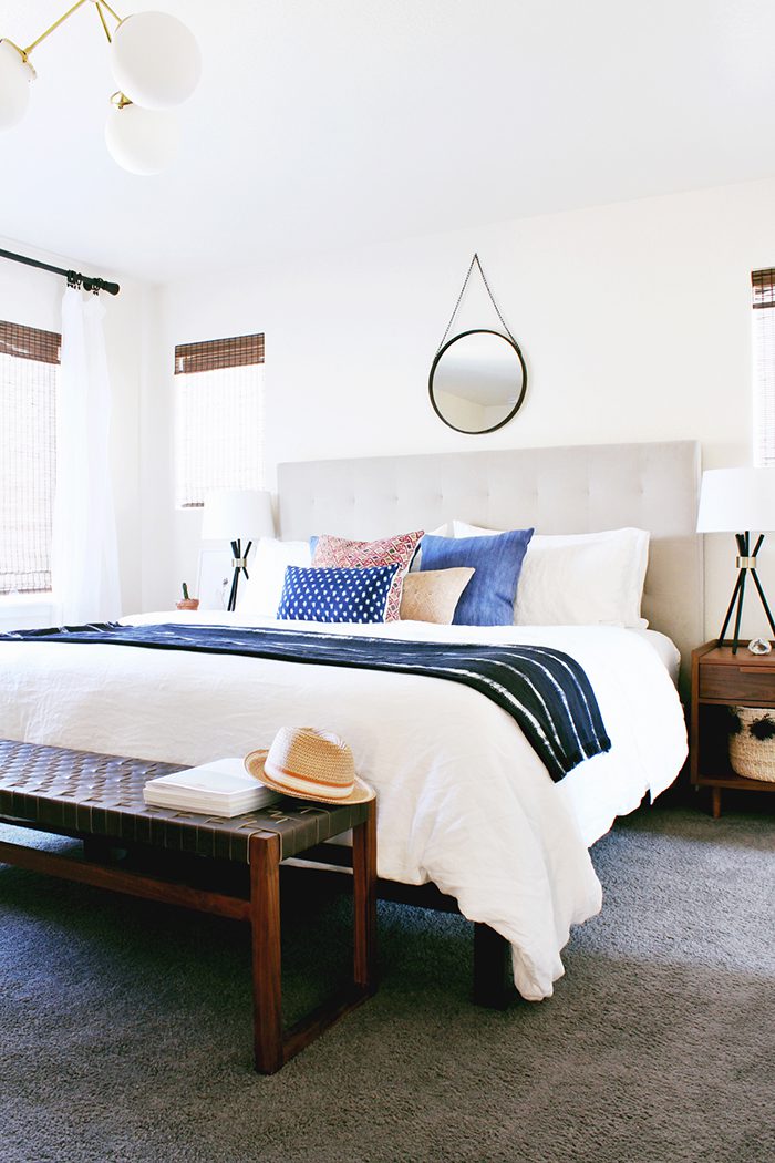
by Anna Smith of Annabode + Co.
Hey guys! I’m so excited to be back on the blog, this time to reveal an eclectic, modern bedroom we recently finished in the Denver area (see the initial design).
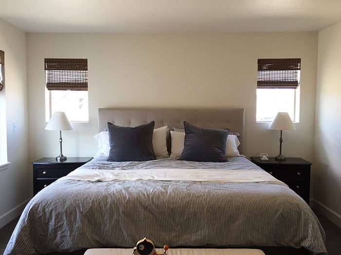
This was such a fun project because it tackled a lot of issues that so many people face; namely how to make a fairly standard “new build” home with builder-grade finishes both unique and reflective of your personality. My client, Gina, had tackled most of the rooms in her house but had left the bedroom untouched since they moved in (sound familiar? I confess I’m currently doing the same!). She had purchased a new bed, but the rest of the furniture was older and of the dark wood/matching bedroom set variety.
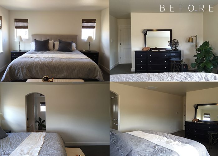
The room had gray carpet and beige walls, so with the neutral furniture it was pretty ho-hum. There wasn’t any of Gina’s warm, peppy personality in it nor her family’s (she’s a momma to two little girls). But it did have great natural light and plenty of space to work with!
There were a few elements that had to be incorporated into the design (the wall color, carpet, woven shades, fiddle leaf fig, headboard, and vintage-style fan), while everything else could go. Gina wanted the space to feel eclectic and bohemian but also minimal and “unfussy”. So, we added lots of texture with linen bedding, vintage textiles, woven leather, and warm woods, but kept the overall look pared-down:
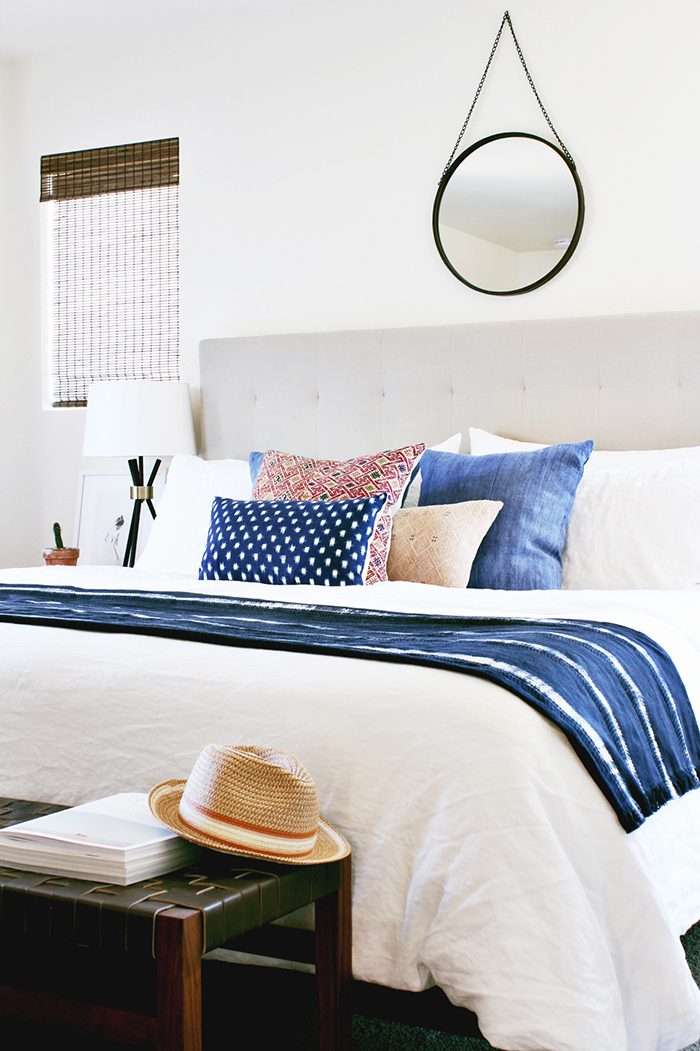
Updating the bedding with white linen did wonders to brighten the space, but we also worked hard to correct the issues of scale that were going on with the original furniture (too-wide dressers, too-skinny lamps, too-tall bed…etc.). Replacing the boxspring with a low profile one brought the mattress height down to the right level for some mid-century style nightstands and prevented it from towering over the bench. (That bench, by the way, is even more beautiful in person and it took all my willpower not to run out and buy it for myself!)
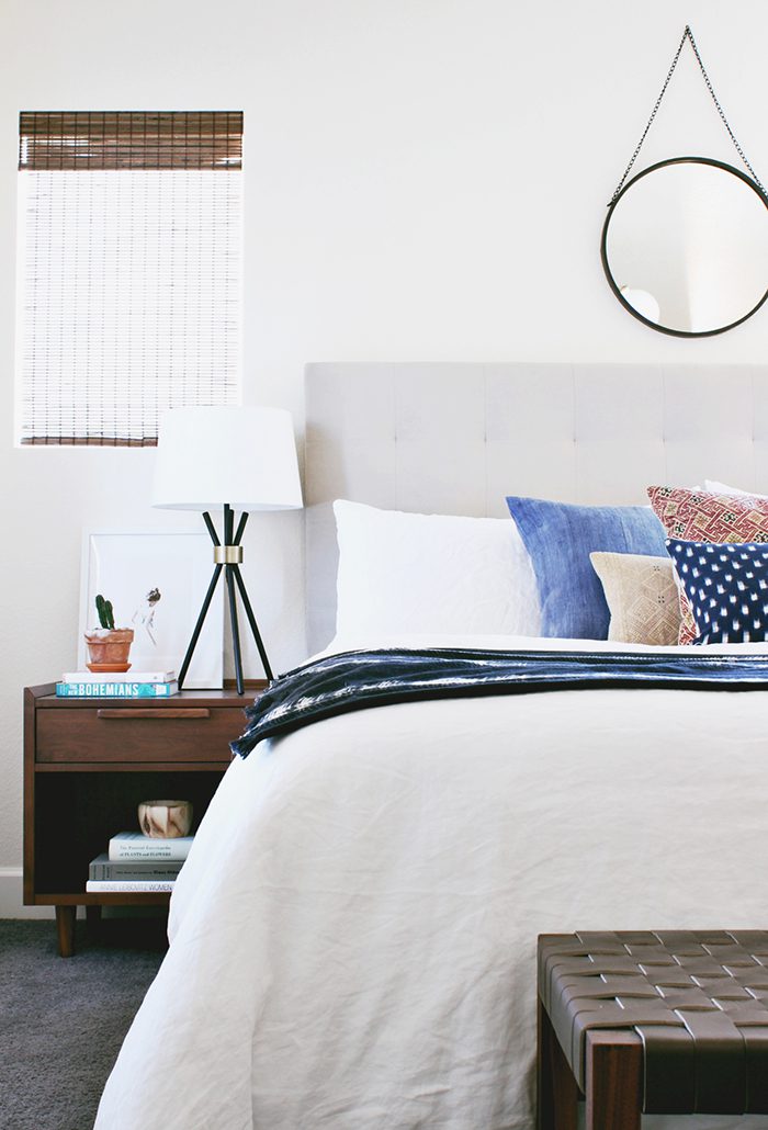
Lowering the bed meant we did need to add a little height elsewhere, or the headboard would have looked out of place. Luckily those lamps are the perfect size, and we had space above the bed for that cute little mirror! Those lamps just kill me–they’re from Allmodern and super affordable, but I love that the bases take up very little visual space and you can still see through to any artwork you place behind them.
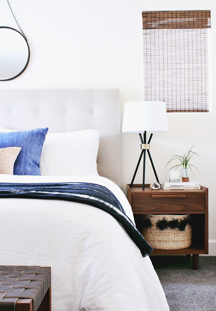
Okay you guys, how ADORABLE is that little pom-pom basket in the nightstand? Moving to Denver has allowed me to connect with so many amazing creative people, and one of them is my friend Caitlin of Zeal Living. Caitlin is originally from South Africa and after being inspired by the quality and beauty of handicraft across the continent, she started her own shop and now imports ethically-sourced goods from artisans in countries like Rwanda, Tanzania, and Cameroon. This particular basket was woven in Rwanda from banana leaf and is such a beautifully simple storage solution for literally anything. I love how it fits perfectly in that opening, but what I like most is that the pom-poms are made from the same material as the basket so they don’t feel too little girlish.
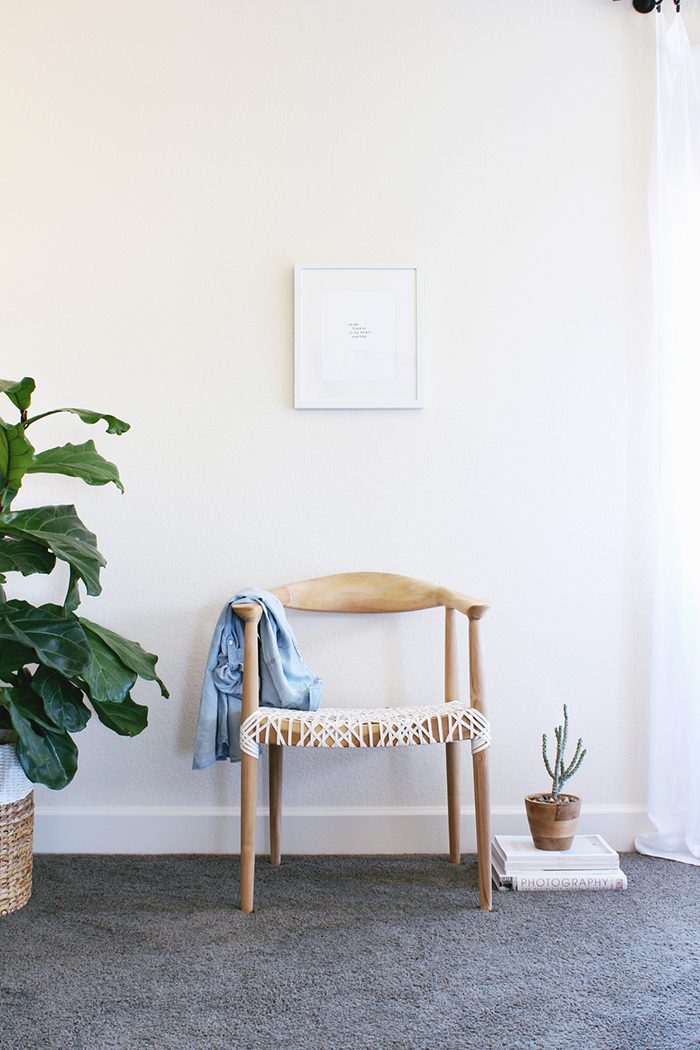
Although our original plan was to create an reading nook in the corner with a lounge chair and floor lamp, after we found the vintage dresser we were left with a tight space and Gina mentioned she didn’t plan on doing any reading in here anyway. We opted for an accent chair instead, under this print which was kind of our mantra for the space.
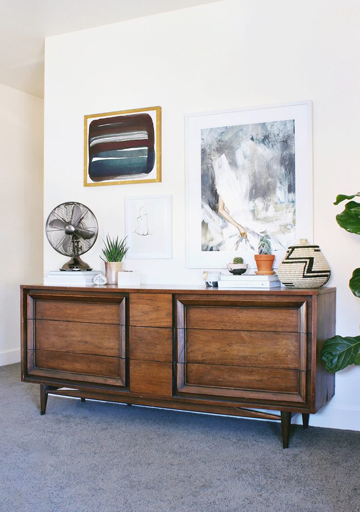
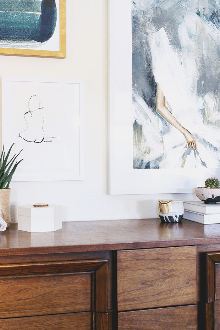
Gina loves mid-century design, so I couldn’t believe it when she told me she didn’t own a single piece of vintage furniture (my Craigslist-loving self gasped!). Obviously we had to fix that, stat–hence this lovely mid-century dresser we scored for a song in Denver’s Design District. During our initial consult, Gina specifically mentioned loving asymmetry so we made sure to incorporate a gallery wall to balance the symmetry of the bed and nightstands.
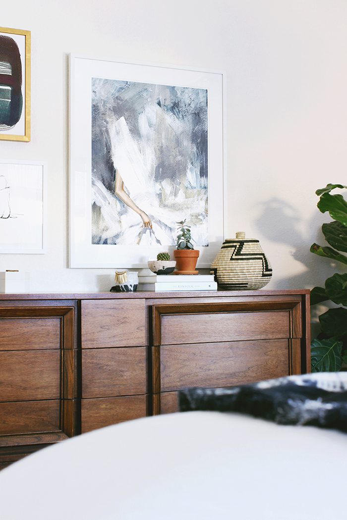
That large print is by one of Gina’s favorite artists, Clare Elsaesser (another one can be found on the nightstand). And that other awesome basket is from Zeal Living again!
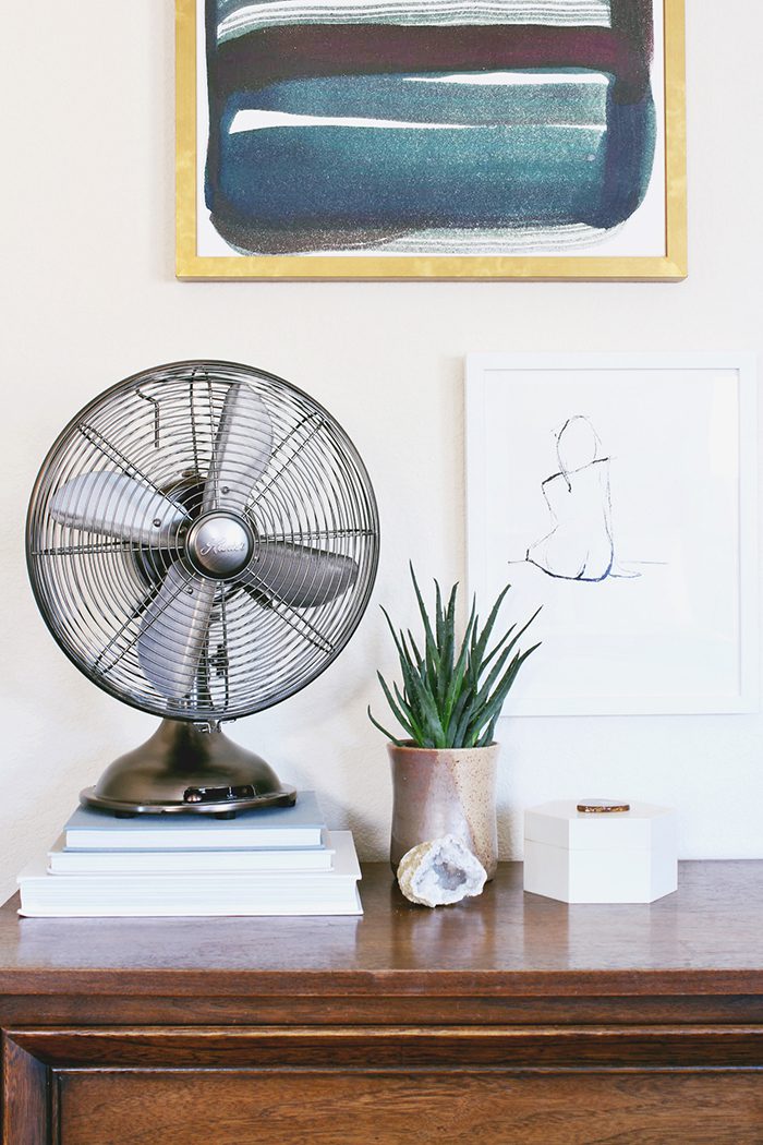
Most of the items we styled with (the books, planters, etc.) were Gina’s but we did add this little agate jewelry box to the mix, under the naked lady.
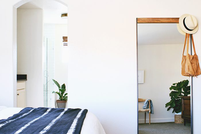
And on the other side of the room was the perfect spot for a floor-length mirror (the room on the left is the master bath).
I loved designing this room, but more importantly Gina and her husband love waking up in it! She told me after installation that they both already felt the difference in having a “finished” space. And what a difference it was:
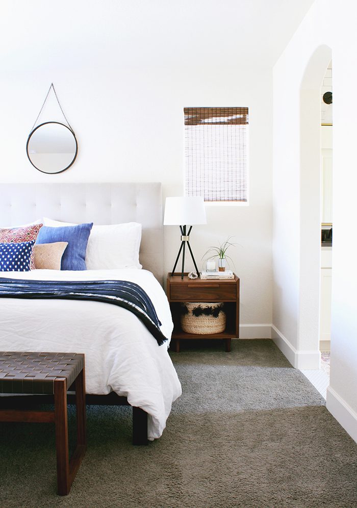
[Sources: Reed Bench // Tensira Bed Cover // Harlow Chandelier // To Be Simple Print // Bentley Arm Chair// Hanging Circle Mirror //Vintage Hmong Pillow // Chinese Embroidery Pillow // Arizona Pillow // Indigo Ikat Pillow // The Arts Capsule Ink Print // Composed Print // Dress Print // Tate Nightstand // Silence Print // Benson Table Lamp // Belgian Flax Linen Sheet Set // Metal + Wood Floor Mirror // Banana Leaf Basket // Lidded Basket // Horizon Planter // Agate Box ]
Thank you, Anna! I love everything you do!
Anna Smith wants to live in a world where good design is accessible and affordable for everyone. An interior designer based in Denver, Colorado, she creates modern homes for clients across the country through her firm Annabode + Co. When not buried in swatches and throw pillows, you can find her elbow-deep in renovations at her own fixer-upper. Find out more about working with Anna at Annabode.com.
Original article and pictures take hitherandthither.net site
Комментариев нет:
Отправить комментарий